
When I'm giving interviews for a numerical marketing role, there's one question I really like to ask:
Say you're marketing a product and your margin per conversion is $10. What cost per conversion should you aim for?
This is a fairly fundamental question when it comes to marketing, and it's one that we all implicitly answer when we run marketing, whether we like it or not. It also seems like a very simple question, but answering it in full can teach us a great deal about how to run marketing effectively.
So, what cost per conversion should you aim for?#
To simplify things a little, I'm going to assume that the lifetime value per customer is the same as the margin per conversion. This is effectively saying that each customer can convert on the product once and once only. This assumption is the norm for a large number of verticals; for example in finance, where customers only ever take out a specific brand's financial products like a credit card or insurance once in their life.
With that assumption out of the way, let's get back to the question. Let's start to answer it by asking another question, why are you ultimately marketing the product? What do you want to achieve?
The answer to this is usually profit. You're marketing a product because you want to make profit.
In a marketing context, profit is the difference between the amount it costs you to generate a conversion (your cost per conversion) and the margin on that conversion (gross profit).

Now that we're clear on what we want, how do we get it?
What we have to realise is that there's a relationship between profit, and the cost per conversion that we aim for. It'll often look something like this:
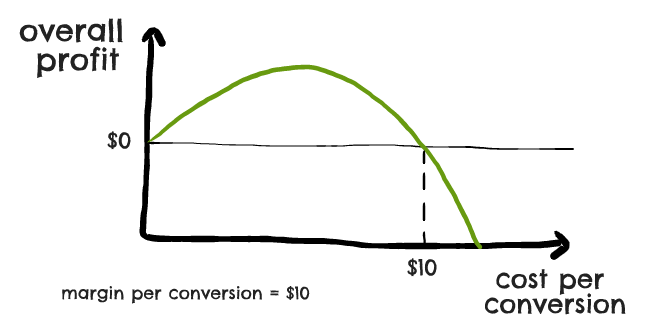
On the left hand side of the graph, profit is low and the cost per conversion is low. This happens because, while a low cost per conversion might mean that we're highly profitable on each conversion, working to such a low cost per conversion prevents us from actually bringing in any significant number of conversions. As a result, our overall profitability is low.
On the right hand side of the graph (where the cost per conversion approaches $10), profit is low and the cost per conversion is high. This happens because, while our high cost per conversion allows us to bring in a lot of conversions, the profitability on each individual conversion is very low. Though we might bring in tons of conversions, the difference between margin and ad costs on each conversion is so low that we don't generate much actual profit.
In the middle of the graph we have a region where the profit is higher than it is on the left or the right. Here our cost per conversion is neither too low or too high. This means that although we can't generate as many conversions as we could at a higher cost per conversion, we're still generating a good number. The fact we're generating fewer conversions than in the last scenario above is more than compensated for by the fact that we're making a much better profit off of each individual conversion.
As a result, we're able to bring in more overall profit than we were in either of the above two scenarios.
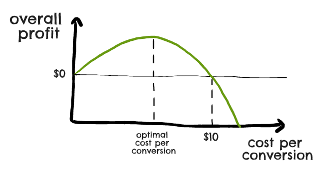
What I've written above should sound true in theory, but it's probably not obvious how we actually put this insight into practice.
It's easy to appreciate that there's some middle-ground between the two ends of the spectrum, but how do we actually find where that is? Put more succinctly, what cost per conversion gives us the highest overall profit?
To answer this question, we need to go back to what profit is:

Gross profit here is the difference between revenue and cost of sales, and so is equal to profit when ad spend is zero.
Like with most mathematical equations, we can start to understand this equation better if we replace some of the terms used in the equation. We know that gross profit is in some way a function of how much we spend, so we can rewrite the equation above as:

To simplify this equation further, we need to understand what gross profit really is. In particular, we need to be able to understand exactly how it relates to spend.
In one of my other articles I cover a few ways to go about this. To keep things simple, I'm going to cover just one method that's outlined in that article, which works when you're running a Google Ads campaign using smart bidding.
Bid Simulator#
If you've run a Google smart bidding campaign before, you may be familiar with a tool called bid simulator.
Bid simulator lets you estimate what your metrics would look like if you were to change your targets.
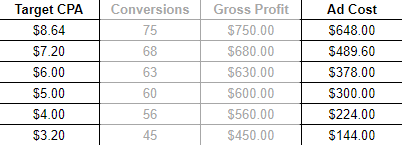
For instance, you might be currently bringing in 60 conversions per week at a $5 cost per conversion; bid simulator might tell you that you could bring in 63 conversions a week if you aimed for a $6 cost per conversion.
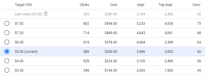
Bid simulator tends to give you a number of different data points to look at. In addition to the metrics for your current cost per conversion, it'll usually give you metrics for 2 or 3 simulations at a lower cost per conversion, and a couple of simulations at a higher cost per conversion.
The data from bid simulator is invaluable because it allows you to understand exactly how your gross profit depends on cost. If you copy the data from bid simulator and put it into Google Sheets you can create a table that looks like this:
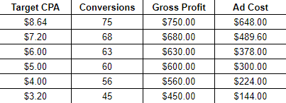
Here I've calculated Gross Profit by multiplying all the conversion numbers by $10 (where $10 is our gross profit per conversion). I've calculated ad costs by multiplying the first two columns together.
Bid simulator has essentially told us how much gross profit we can make for each level of spend. But it's only told us this for the few data points that it's made visible, so how do we understand that relationship at a more fundamental level?
Finding Relationships#
We can take a stab at this by trying to find an equation which fits the data that bid simulator has provided. To do this, let's make a scatter graph from the data and add a line of best fit.
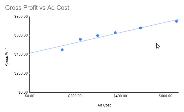
The graph above features a linear line of best fit. Clearly we can see above that the data isn't linear, and a linear line of best fit doesn't make sense.
If we switch the line of best fit's setting to logarithmic, it looks like this line fits the data much more closely:
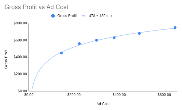
You'll notice at the top of the graph I've set Google Sheets to show the equation of the line:

For those unfamiliar with the 'ln' term, it represents a natural log. It's the opposite of an exponential, if you've come across those before.
Now that we have an equation for gross profit, we can substitute that back into our earlier equation for overall profit, and get:

This might look arbitrary, but if we plot it in a graph we can see that it shows us an interesting shape:
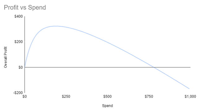
This graph is useful because it tells us two important things:
- It tells us that there comes a point at about $800 worth of spend where, if we go beyond that point, we'll be losing money on our marketing. This is because the cost per conversion we'd have to aim for to spend that much would be equal to or greater than our gross profit per conversion, $10.
- More importantly, there is a point somewhere around $200 of spend on the graph where our profit is at its maximum.
This second point is key; if we can find out how much spend corresponds to that peak, then that's our optimal spend level. It's the level of spend which generates the most overall profit, and therefore the ideal amount to be spending on our campaigns.
Finding The Peak Spend Level#
To find this spend level, we have to do a little bit of calculus. We said earlier that the graph above corresponds to the equation:
We know that at the graph's peak, the line of the graph is flat. This is equivalent to saying that when you're at the peak, small changes in spend have very little (if any) impact on profit.
We can express this mathematically by talking about the derivative of profit with respect to ad spend. This represents how much profit changes with a change in ad spend:
- On the left hand side of the graph, the derivative is positive. This means that an increase in ad spend leads to an increase in profit, i.e. that the graph is pointing upwards.
- On the right hand side of the graph, the derivative is negative. This means that an increase in ad spend leads to a decrease in profit, i.e. that the graph is pointing downwards.
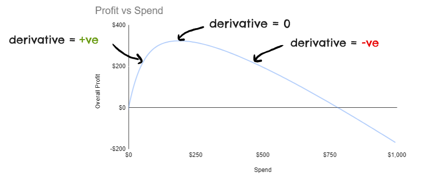
As you might have guessed by this point, the derivative right at the peak of the graph is equal to zero. As I said earlier, this is because around the peak, very small changes in spend have no impact on profit; the graph is flat at that point.
How does this help us?#
If you did calculus in school or college, you might remember that you can calculate the equation for a derivative. If our equation for profit is:
Then we can work out that the derivative of profit with respect to ad spend is:
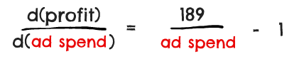
Now we said that the left hand side of the equation (derivative of profit with respect to ad spend) is equal to zero when we're at the peak of the graph. We can write this as:
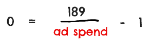
Which we can then solve as follows:
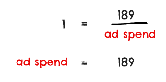
What this is telling us is that the value of ad spend which corresponds to the peak of the earlier graph is $189. Go back and look at the graph, and you'll see this lines up.
We've therefore worked out that the level of spend which is likely to generate us the most profit, is $189.
We can take this information and budget cap our campaigns at $189 a week, or we can translate it into a target cost per conversion.
To do this second option we can go back to the bid simulator data we pulled earlier, which gave us data points for both cost per conversion and spend:
We can do exactly what we did earlier to find out the relationship between gross profit and ad cost, which is to find the line of best fit between the two:
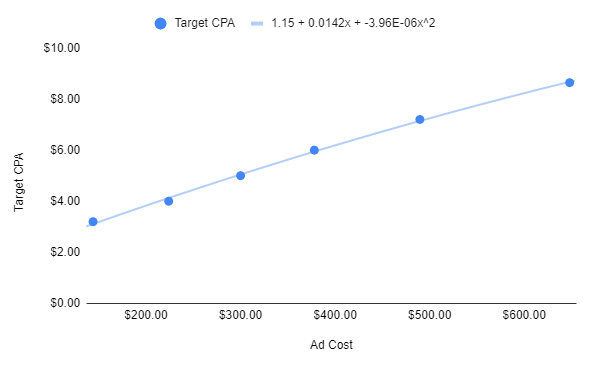
The only difference between this and what we did earlier, is I've fitted a polynomial equation to the graph this time, instead of a logarithmic one.
You can see this at the top of the graph; it tells us that:

If we plug in the value of ad spend we got earlier ($189), we end up with a cost/conversion of $3.69.
This is the best answer we can give to the initial question. Assuming that the bid simulator data is correct in this case, the cost per conversion which maximises profit for a product with $10 gross profit, is $3.69.
If our cost per conversion is anywhere either side of this, we'll bring in less profit:
- If our cost per conversion is a little bit lower, then sure we'll bring in a greater amount of profit per conversion, but this will be outweighed by bringing in fewer conversions.
- If our cost per conversion is a little bit higher, then sure we'll bring in more conversions but this will be outweighed by having a lower profit per conversion.
Simply put, $3.69 is the optimal cost per conversion in this scenario. It's impossible to generate more profit at a different cost per conversion.